Create Your First Project
Start adding your projects to your portfolio. Click on "Manage Projects" to get started
Get Green
January 2022 - June 2022
User Research, Prototyping, Design
Tools: Figma/FigJam, Google Surveys, Usertest.com
Team: Roz Gillie, Cato Cannizzo, Sebastian Priss, Lara Hattatoglu
In partnership with a Seattle startup, our team led research and design efforts to improve user retention and daily engagement in the GetGreen app.


Background
GetGreen is an app that helps people adopt sustainable habits by suggesting daily actions and awarding “leaves” that can be donated to environmental projects. The team was asked to explore ways to improve user retention and long-term engagement, especially around goal-setting and daily behavior tracking.
My Role: I contributed to all design deliverables and had specific ownership of Surveys, Participatory Design sessions, User Journeys, and Personas.
The Challenge
The GetGreen app was having issues with long-term user retention. The product struggled largely because it didn’t offer a defined task flow, sufficient in-app guidance, meaningful personalization, or features that help users build consistent habits.
Research Approach
To understand user behavior and pain points, we conducted a two-week diary study, a survey, and a participatory design session.
Diary Study
To begin our research, we took GetGreen’s current implementation of the geofencing user experience and conducted a longitudinal diary study. The diary study allowed us to follow users for two weeks as they interacted with the app notifications and task flow. During this time they would take notes of their experience and identify any pain points that should be addressed.
Intention: Understand how GetGreen fits into the users day-to-day life.


Survey
We also used surveys to collect general user feedback on the type of features they would like to see from the app. This was conducted alongside the timeline of the diary study and gave us an understanding of potential users beyond the ones in our study. This survey informed us on how we can increase user retention through features outside of those present within GetGreen’s app.
Intention: Understand whats users would like to see in Get Green as opposed to other apps they use.
Participatory Design
After the diary study, we then met with some of the participants to hold a participatory design session. We unpacked their experiences with the app to gain insight into how they believed the experience could be redesigned. This allowed us to understand how users interacted with the app in their everyday lives, and how it fits into their daily schedules.
Intention: Have user's share their honest thoughts now that they have interacted with the app for 2 weeks.


Research Findings
-
Users were shown actions that didn’t apply to them, leading to frustration.
-
Actions lacked variety, making daily use feel repetitive.
-
Users struggled to maintain any long-term habit because repeated tasks were hard to track.
-
There was little trust in geolocation features due to unclear communication.
-
Users wanted more customizability in notifications and the types of actions they see.
-
The app lacked guidance during core flows like choosing a goal or completing an action.
These insights led us to redefine our direction:
How might we support users in creating sustainable habits through better personalization, goal clarity, and task management?
Design Strategy & Ideation
1
Goal Focused Onboarding
Users needed clearer, more relevant starting points.We introduced goal categories and goal previews, enabling users to browse actions before committing.
3
Customizable Notifications
2
Action Planning & Habit building
Users wanted to build habits, not just complete one-off tasks.
We designed a dedicated Action Plan where users could:
-
Add actions tied to their chosen goal
-
See progress at a glance
-
Get reminders for habit formation
We redesigned the notification system to give users control over:
-
Which categories to receive notifications from
-
Frequency and timing
-
Do Not Disturb hours
-
Scheduling repeatable actions
Initial Designs
With our design goals in mind, we then created low-fidelity wireframes that we could use for user testing. Here are the wireflows that showcase the process of adding a goal, rescheduling a task, and changing your settings.

Testing & Refinement of our Wireframes
Outcomes
Before moving onto our final designs, we put our low fidelity designs in front of potential users to test the usability, desirability, and feasibility of our changes to the application. We wanted to ensure that the navigation of the application was intuitive, the features were desirable, and that user’s did not run into any critical issues that prevented them from completing a task.
After gathering the participant data and affinity mapping the results, our team was able to identify six major pain points in the revised design.
-
During the goal selection process, some user’s desired being able to view information about the goal before clicking it.
-
They also found it frustrating that the whole action card was not clickable and wanted a back button to be able to navigate to the previous page.
-
When prompted to complete an action, one user was unable to locate the complete button.
-
There was also little to no desire for a separate list view of the action.
-
When customizing the notifications for the repeated actions, some users were confused by the terminology.
-
Terms such as “refresh now” and “in-queue” were not intuitive to users.
In terms of overall experience, our low fidelity designs averaged at 81 out of 100 on the US Government System Usability Scale(SUS).
Addressing Pain Points
User Ask
Design Update
Desire to view information about the goal before clicking it
To address this issue, we created a dropdown for the goal card that revealed some of the actions
User Ask
Design Update
On the homepage, participants struggled to mark a task as complete.
Added a 'Complete' Button to the card view.
User Ask
Design Update
Wording of the notifications page confused users
Changed the wording and updated the format of the repeated actions modals. Now users can select how often they want to complete the repeatable action as well as what days of the week they want to complete it, giving them more control over their action plan.
High Fidelity Designs
For the final stage of our process, our team created high fidelity wireframes. The high fidelity wireframes incorporate our user test findings along with the visual branding and UI elements of the GetGreen application. The purpose of these wireframes are to communicate the refined, redesign of the application for development.
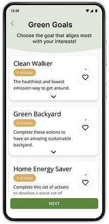
Plan Onboarding
This goal-centric approach allows users to choose the goals that fit their interests, tasks within that goal that fit into their lifestyle, then a way to track their goal progress as they complete the tasks.


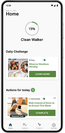
Habit Building
To make a repeatable action a habit, users are prompted to create a repeating notification after completing the action once. The user is first asked if they want to form a habit, then they choose the frequency of notifications for that habit.


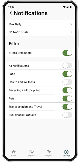
Notification Settings
To address the lack of customizability regarding notifications, the users can now choose the categories that they receive notifications for, set a max daily notification count, schedule do not disturb hours, and go back to edit their repeated action settings


Reflection
This project was my first experience designing with real-world constraints and a live stakeholder. While our research—especially the diary study—had execution challenges, it taught me the importance of piloting studies, recruiting thoughtfully, and pressure-testing technical dependencies early. Leading this project also shaped how I show up as a collaborator and project driver today. Despite the bumps, I’m proud of the impact and how strongly this experience influenced my approach to product design.
